|
||||
|
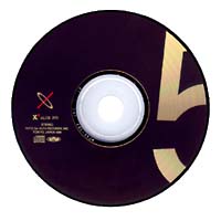
The style of the Boxes follows much of TC+P's previous work with Depeche Mode. It relies heavily on typographic design (using letters and numerals) and uses few photographic or illustrative elements. The main logo's 'X' is comprised of an orange-red 'I' that is slanted to the right interlaced with a silver-grey 'O' that is slanted to the left. These colors, in addition to black, are used throughout the design of the set.
Full size The jewel case covers identify the disc by using photgraphic representations of many diferent elements from the art that was on Depeche Mode's previous releases. For example, the cover of disc 3, 'trois' uses three sledge hammers aranged in the shape of the numeral three. The sledge hammer (as a design element) was used on the cover of Construction Time Again album and the single, Love, In Itself. Each disc's page identifies the symbol's reference. The booklets that are included with each box have the liner notes for the discs in their respective boxes. The booklets are 8 pages (including the covers) long. They use the orange-red and black for the papers and a reflective grey-silver ink and white for the text. All text is set in a sans serif face, likely a variations on Gill Sans. I have not scanned the booklets for fear of damaging my copies. If anyone is interested in scanning their copies, please contact me. |
||||
|
Further Resources: General Information about X1 and X2. Track Listing for all discs. Article from Music Collector magazine. Original releases of the tracks are listed here. Comments from people viewing this site. |
||||


[ Read and write comments ]